Problem
The product hadn't been redesigned since being launched in the 90's which led to end user and client dissatisfaction with the current platform’s outdated user interface, suboptimal and inefficient workflows, and process rigidity. Executive leaders wanted business expansion without multiplying operational and human capital costs.
Solution
Our objective was to bring the client into a new modern era by providing a comprehensive and coherent redesign of the User Interface and User Experience of their Loan Management System by focusing on the users every step of the way. Our work was projected to have a 20% cost reduction in their process.
Scope
22 pages were created between 5 main areas of the product. Search functions and FEMA notifications were also designed.
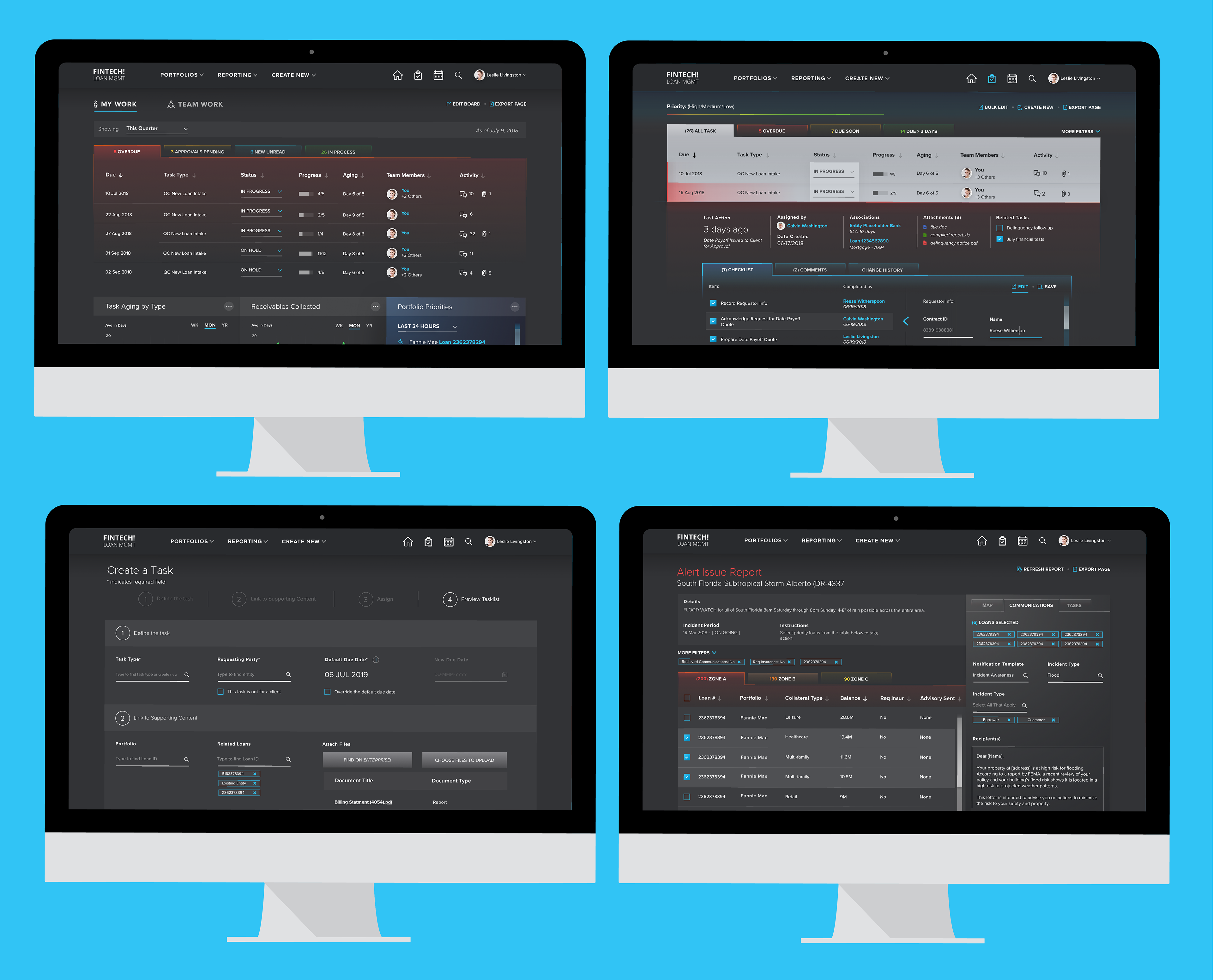
Key Screens
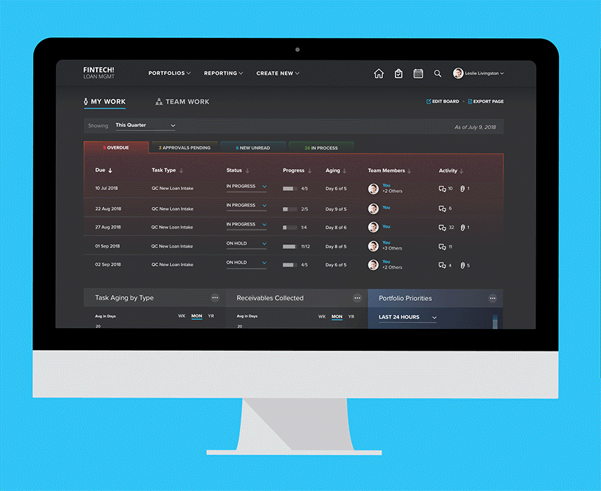
Dashboard
There are two dashboards, one for managers and one for employees. Each one has valuable information for the daily tasks they need to do. The information is color coded to make digesting information at a glance easy.
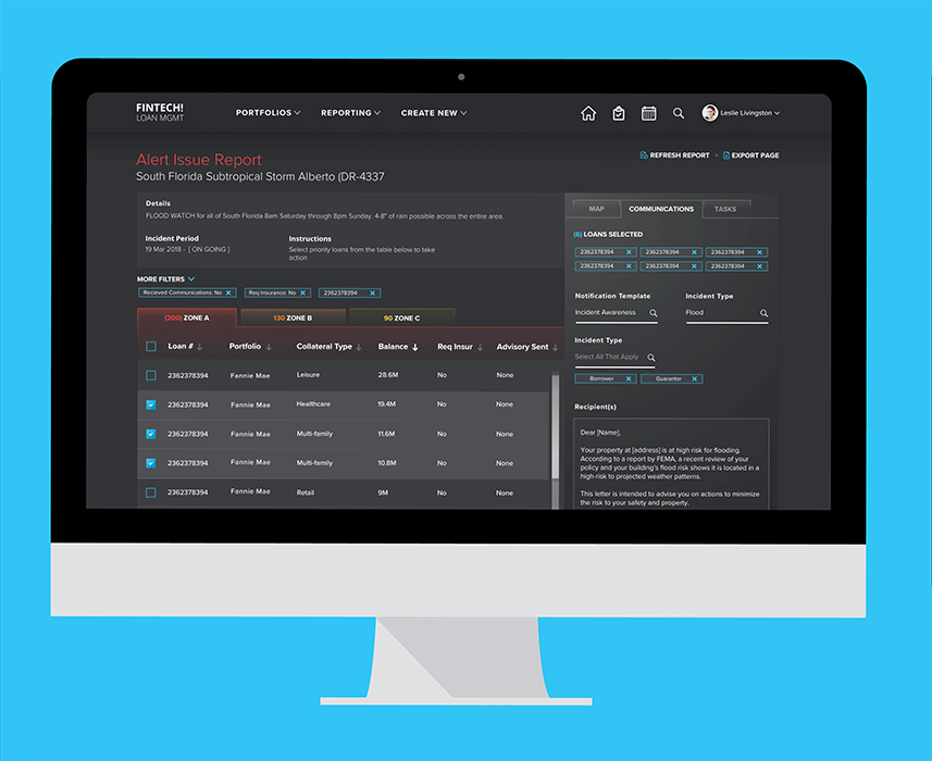
FEMA Reports
When there's weather events that occur that impact loans, an alert comes up with access to reports of those loans. On that page, the user has access to a map view with zones of the area showing the number impacted, an easy way to communicate to the loan holders and a related task list.
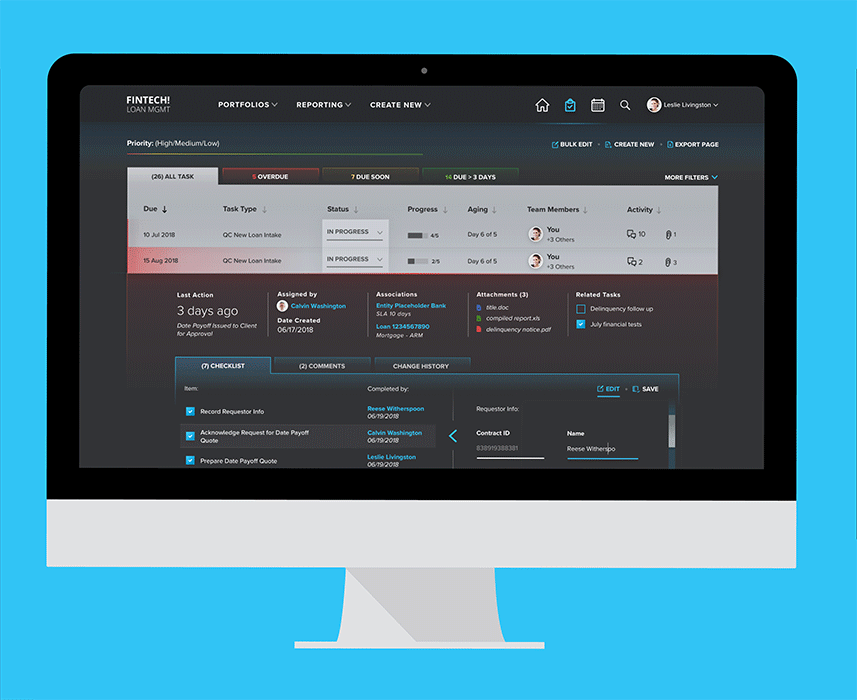
In Progress Tasks
The tasks that are in progress are organized and color coded by priority with access to important task lists and information to make their work easier.

Create a Task
Managers are able to create a task. They go through the steps at the top to make more of the process and fields appear. This way, the user doesn't get overwhelmed by the length of the page and they are still able to go back to edit data.
The Team
The design team was comprised of two visual design leads, one visual designer, one user experience lead, one user experience designer and a design intern.
Information Redesign
Based on the insights gained from the Personas, Journeys, and User Flows we created wireframes to serve as a page schematic or screen blueprint. These wireframes were used to test our planning, gather feedback and iterate the design prior to visual treatment. They serve as a basic visual guide for the user interface design used to develop the prototype.
Visions of Positive Change – ‘Art of the Possible’
A series of Human-Centered Design workshops conducted by the UX team identified:
Current system benefits: Robust system stability, broad set of capabilities
Functional areas ready for improvement: Difficult navigation, lack of automation – too much manual entry and risk of human error
Key pain points and efficiency bottlenecks: Task management, lack of system-wide search, disjointed loan information
A New User Experience
The UX team conducted 24 interviews with users at companies that purchase the software as well as employees of the client. Personas, user journeys and user flows were also created.
Theme
An overall dark theme was chosen to increase readability over time which creates less eye strain. It also allows for accent colors and images to stand out more. Areas of light colors were also incorporated to emphasize specific areas on the page and also used in high content areas like large tables.
UI Styling
Gradients, shadows and transparencies were added to create depth and add contrast to modules and data points on the pages.
Color
Sticking close to the clients branding, blue was chosen as the main accent color to draw the users eyes to the important areas of content. White labeling was kept in mind for clients that license the software and want to change it to fit their branding more closely. Red, yellow and green were also used to show urgency in areas of the product that align closely with common daily tasks.
Clickable Prototype
An interactive demo was done in InVision so the client could realistically move throughout the pages to show them how the final version could work.
Responsibilities
I helped pitch visual directions to the client and took the final direction and applied it to the product. I had full control of taking the wireframes and turning them into final visual designs for the manager dashboard, create a task and FEMA pages. I also helped with the prototype in InVision and cleaned up presentations and graphics.